New Zealand Landscape Photographer Talks Understanding Aspect Ratios
Share
A New Zealand landscape photographer tutorial
New Zealand landscape photographer Stephen Milner talks understanding aspect ratios for landscape photography. This blog is part of my HOW TO TAKE LANDSCAPE PHOTOS - TEN STEPS TO CREATING SUCCESSFUL LANDSCAPE IMAGES tutorial series.
For a list of landscape photography equipment that I use, please check out My Gear List.
In this tutorial, I try to explain the importance of aspect ratio selection for my images. Aspect ratios are an essential consideration for the composition of my landscape images. When I compose for landscape photography, the two aspects of the landscape that I will consider the most are the placement of subjects in my frame and the spatial distances between them and the aspect ratio. These three points drive my selection of aspect ratio.
In essence, the process of aspect ratio selection is mainly to provide a suitable frame size for the content of an image. The chosen aspect ratio should complement the composition of the scene and emphasise its subjects. It can also be considered a boundary that maintains the focus of a viewers eye.

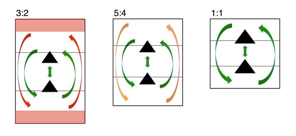
Figure 1. Aspect Ratios and Spatial Distances
This illustration demonstrates how the aspect ratio can control spatial distances in the composition of a landscape image.
DESIGNING THE IMAGE
Before I arrive at my location, I always plan and research my landscape photography locations. I will know what the main landscape subject of interest is. For example, my main subject of interest will be a mountain, a waterfall or a coastline. I will have camera position options in mind, and I will research them with my pre-planning process. When I am at my landscape location, I start to design the image. If I am lucky, the Image design can be a quick process, or it will take some time. Either way, I always give myself plenty of time for research in the field by arriving early, and I always keep my plan open to change.
My image design starts with an on-location review of my pre-planning and an overall assessment of the surrounding landscape. I will visit each location of interest, and I investigate other options nearby. There is always one key consideration that remains the same, which is my main subject of interest.
As I investigate each area, I connect my main subject of interest with the surrounding landscape. The careful placing of objects in the frame of my camera will create a feeling of connection in the final photograph . Once I have the objects placed in the frame of my camera, I chose an Aspect Ratio.
PLACING OBJECTS IN THE FRAME
When you compose your landscape photos, you are essentially designing an image. You are a composer of the landscape around you. The choices you make on your camera location, your tripod height, the position of the objects in your camera frame and the distance between them affect the look and feel of your final photo. You must look closely at the details and shapes in the foreground of the surrounding landscape. These details are diagonal lines, curves, s-curves, symmetry, texture and tones. Look carefully at the spaces between them and your main subject of interest, and the edges of your aspect ratio.

Figure 2. 3:2 Aspect Ratio in Portraiture
This image illustrates a composition with the foreground detail bottoming out. It draws your eyes to the bottom of the frame and keeps them there longer than they need to be.
When I frame my composition I give To adjust the distances between the edges of your aspect ratio and the objects within it, you must consider your lens of choice, your tripod position and your camera height. These factors will affect how they appear in your final photo.
When you compose your photograph, you must consider how the eyes of its viewer will move through it. I use the viewfinder of my camera, which helps focus my eyes on the elements within my photo. It removes the surrounding views from my vision. The viewfinder of my camera will show the aspect ratio that I have chosen. It helps me focus on my composition and verify my photo visualisation.
In essence, this is the art of composition, and I cover this in a separate composition tutorial. For the remainder of this tutorial, we will be focusing on aspect ratios.
So, after you are happy with your compensation, it is time to select the aspect ratio. You must set the aspect ratio setting in your camera to the same aspect ratio that you will use when you print your image. If your camera does not have your desired aspect ratio, choose one that is the closest. If needed, allow some extra room around the edges of the frame for cropping in post-processing. This approach will help you capture the image with the correct amount of spatial distance in the frame. Plus, it will help you visualise how the final image will look in print.
To assist your understanding of the different aspect ratios, I have provided examples of my work, which can be seen throughout this blog in Figures 2 to 12. I will refer to these images as I discuss aspect ratios in more detail.
Figure 2 above shows a composition with symmetry between the volcano and the foreground plants. The aspect ratio is 3:2 in portraiture orientation, which I chose because there was no detail to the sides that added value to the image. The lens focal length is 25mm, the tripod is approximately three meters away from the foreground bushes, and the camera height is 1.9m high. As you can see, the foreground detail is bottoming out, and there is lots of space at the top of the frame. When I look at this photo, it feels unbalanced. My eyes have difficulty moving around it. Each time I look at this photo, my eyes initially look at the small bushes at the bottom. They then move up very quickly and then move back to the bottom. In a way, my eyes are stuck at the bottom of the image. This image is very bottom-heavy in detail compared to the top half. Whilst the top half captures the very pleasing morning hues of the belt of Venus, there are no details to help balance the photo.

Figure 3. 3:2 Aspect Ratio in Portraiture
This image illustrates a composition with an unbalanced foreground.
Figure 3 is an improvement in Figure 2. It is the same composition with an aspect ratio of 3:2 in portraiture and has the same camera set-up. However, vertical adjustment of the camera angle reduces the sky and provides more space in the foreground. The photo has a more balanced view of the spatial distance between the objects (volcano and sky). However, there is now excess space at the bottom of the photo. The photo now has a top-heavy feel to it. My eyes linger at the top of the image.
Figure 4 shows further improvement over Figure 3. Again, it is the same composition with an aspect ratio of 3:2 in portraiture and the same camera set-up. However, further vertical adjustment of the camera angle has balanced out the sky and the foreground. When I look at this photo, the distances between the foreground bush detail and the volcano on the horizon feels stronger and connected. However, whilst this image has a strong balance, there is still room for improvement. There is a large amount of space in both the sky and foreground. This space is uncomfortable to my eyes. My eyes are in the middle of the image.

Figure 4. 3:2 Aspect Ration in Portraiture
This image illustrates a stronger composition with excess spatial distances.
Figure 5 is the same image but with a different aspect ratio. This time the aspect ratio is 5:4 in portraiture. This image is a significant improvement from the previous photos. My eyes find this photo more balanced than the others. When I look at this photo, my eyes start on the bushes. Next, they move to the volcano and then to the sky. My eyes then move around the edges of the frame in an anticlockwise motion. They then pause at the bushes for a few seconds. My eyes continue to move around the image in this way, focusing on new details each time.

Figure 5. 5:4 Aspect Ratio in Portraiture
This image illustrates a 4:5 aspect ratio with an improved balance of spatial distances.
My favourite version of this photo is the 1:1 aspect ratio. Figure 6 is the same but with a 1:1 aspect ratio. When my eyes look at this photo, the aspect ratio emphasis the relationship between the bushes and the volcano whilst providing enough spatial distance around its best features. I also find that it cuts out some imbalances in the foreground and sky of the image. Overall this image feels well balanced to my eye.

Figure 6. 1:1 Aspect Ratio (Square Crop)
This image illustrates a 1:1 aspect ratio which strengthens the composition and has a good balance of spatial distances.
Whilst I think Figure 6 is my favourite, I also like the 5:4 version in Figure 5. The 5:4 aspect ratio (or 4:5 if you are shooting in landscape) is a good compromise between 1:1 and 3:2. I am not a fan of 3:2 because I feel that it is too broad and narrow. To fill the frame of 3:2 requires a lot of well-placed detail around the edges of the frame, or you don’t fill the frame, and you have large empty spaces. To my eyes, too much detail that does not add value to a photo can lead to a cluttered photo, and not enough detail can lead to unbalanced images. The 4:5 aspect ratio is a good comprise because it has modest width and height, it is very workable in both portraiture and landscape formats, and it is a traditional format.
In essence, when you are composing your photos, you are placing objects in the frame of your chosen aspect ratio, and the spatial distances around them are essential to consider. When you are out in the field composing your photos, allow your eyes the time to consider the factors that I have discussed above, and I am sure you will see an improvement in your work.
WHAT WORKS FOR THE SCENE
In essence, the process of aspect ratio selection is mainly to provide a suitable frame size for the content of a photo. Your chosen aspect ratio should complement the composition of the scene, and it must emphasise its subjects. It is a boundary that maintains the focus of the eyes of its viewers.
There are many aspect ratios to choose from, and they all have their place in landscape photography. The images below are samples of my work with different aspect ratios. In this section, I use these images to explain the selection of aspect ratios for a scene.
1:1 Aspect ratio
The 1:1 (6:6 or square crop) aspect ratio is considered a legendary frame size, and it is often associated with fine-art photography. The 1:1 aspect ratio was the ratio of choice for the legendary Hasselblad medium format film cameras. I find this aspect ratio the most forgiving aspect ratio to use. It is my go-to aspect ratio because it does not have a lot of open space, and it makes me focus on my subject and foreground detail. It can be tricky to compose because of this. However, when you master it, it is the best aspect ratio for displaying photos that focus on the essential features of the landscape. When I am in the field, I find this is a good aspect ratio because it helps my eyes discover the best aspects of the landscape. I also like the traditional fine-art look of the 1:1 aspect ratio images.

Figure 7. 1:1 Aspect Ratio
The 1:1 (6:6 or square crop) aspect ratio will give your photos a traditional fine-art look.
4:5 Aspect ratio
The 4:5 aspect ratio is considered traditional because of its link to large format film cameras. It has a slightly more spacious view than the 1:1 aspect ratio. It has a modest wide field of view, and it is easier to use. Generally, it is wide enough to allow good foreground and main subject details, and it is not too wide to create unnecessary space. It works well in both landscape and portraiture.

Figure 8 4:5 Aspect Ration in Landscape
This photo is in the 4:5 aspect ratio, and it is in landscape orientation, which provides a modest wide field of view and retains a traditional feel.
3:2 Aspect ratio
The 3:2 aspect ratio is generally the standard sensor size of most modern-day digital cameras. It is also the aspect ratio of 35mm film cameras. When you consider the full range of different aspect ratios, from 1:1 to 16:7, the 3:2 ratio is roughly in the middle. The 3:2 ratio is a sensible choice for digital camera manufacturers because of its flexibility for cropping during post-processing. Whilst this is the standard format for most modern-day cameras, it is an awkward ratio. In my opinion, it is too wide for traditional landscape photos and is not wide enough for panoramic landscape photos. There is too much space to fill, and for panoramic, there is not enough space. Whilst there are some difficulties when working with a 3:2 aspect ratio, it is possible to take good images with this ratio.

Figure 9 3:2 Aspect Ratio in Portraiture
This photo illustrates the use of the 3:2 aspect ratio in portraiture. As you can see, it has some unnecessary space around the edge of the image, which is at the bottom of the image. To improve this image a, 4:5 ratio crop in post-processing will help.
Panoramic aspect ratios (2:1,16:9,17:6)
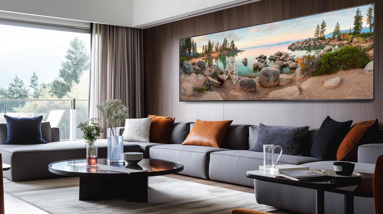
Due to the requirements of panoramic landscape photos, naturally, the aspect ratios used for panoramic images are very wide. The common aspect ratios used for it are 2:1, 16:9 and 17:6, and you can see examples in Figures 10 to 12.

Figure 10 2:1 Aspect Ratio in Landscape
This photo illustrates the 2:1 aspect ratio. It has a balance between width and height, which provides a modest wide-angle view.
Most modern-day digital cameras provide a setting that is considered panoramic. When I am shooting panoramic photography in the field, I choose the aspect ratio setting closest to how I want the final image to be, and for my digital camera, this is 16:9.

Figure 11 16:9 Aspect Ratio in Landscape
This image illustrates the 16:9 aspect ratio. It will provide a wider and shallower view compared to 2:1.
It is possible to take multiple exposures across the landscape to create a panoramic photo in post-processing. Set your camera up in portraiture ordination and photograph the landscape in segments, with some overlap. The post-processing software you use must have a feature that will stitch them together. If I am relying on one image or stitching images, either way, there will be some cropping required in post-processing. When taking panoramic photos, I always leave myself some room for cropping in post-processing.

Figure 12 17:6 Aspect Ratio in Landscape
This image illustrates the 17:6 aspect ratio. It has a wide and narrow field of view.
When choosing your panoramic aspect ratio, the deciding factor must be how much detail you want in the top and bottom of your photo; and how wide the scene is. Figures 10 to 12 show an iteration of an aspect ratio that becomes slightly shallower and wider.
From a composition point of view, the 2:1 and 16:9 provide enough vertical space in the frame to allow for good detail in both the horizon and foreground. These aspect ratios are easier to work with than the 17:6 ratio because they allow enough space for both horizon and foreground detail, as shown in Figures 10 and 11. Although the 2:1 and 16:9 aspect ratios are easier to work with, I like the wider view of 17:6. It is essential to have a point of reference in the photo that provides the scale of the scene.
LANDSCAPE VS PORTRAITure
When choosing my aspect ratios, I always consider what orientation I want the final photograph to be. It is normal to photograph the landscape in landscape orientation. However, not all landscapes have interesting detail across the width of the landscape orientation. Quite often, I find myself framing composing my photographs in a portraiture orientation. Portraiture orientation helps me eliminate unnecessary detail from the edges of my frame.
Sometimes, I compose with my digital camera in landscape orientation when photographing a single exposure panoramic, as shown in Figures 8 and 10. In essence, when I choose landscape or portraiture, I let the composition of my landscape image decide which to use. However, my aspect ratio of choice is 1:1. When I am using my digital camera, its orientation helps me focus on the composition.
WHAT WORKS FOR YOU
As with most things in life, landscape photography is subjective and is open to personal taste and interpretation. Over the years, I have spent a lot of time learning different landscape photography techniques and styles through reference to other peoples blogs and books. In more recent years, I have learnt to explore my own techniques and style. With reference to my initial learnings, I have developed a set of techniques that work for me and I have now created my own style.
CROPPING
When taking photos out in the field, regardless of the aspect ratio, be sure to always leave yourself some room for further refinement in post-processing with the cropping tool.
Most modern digital cameras provide options within their setting for the user to select an aspect ratio. When you are on location, select the aspect ratio closest to how you want the final image. When you are shooting in RAW format, this is non-destructive. There are aspect ratio options in the post-processing software you use
The BEST ASPECT RATIOS FOR LANDSCAPE PHOTOGRAPHY
Through this tutorial, I have tried to explain what I consider to be the best aspect ratios available to landscape photographers. My experiences have shown me that the best aspect ratio is the one that complements the composition of the scene and emphasises its subjects.
Hopefully, you now have a better understanding of aspect ratios. During sunrise and sunset shoots, the light changes dramatically and quickly, and the time during these periods is short. With this in mind, it’s essential to plan your shots, and this will put you in the best possible position to creating a successful image in the best possible light.
I hope you have enjoyed reading this blog, and I hope you have learnt something new.

